http://www.austinmeat.com/kobe_beef.htm
Love the awkwardly tiling background image!
Tag: Web Design
Opera Mini Browser
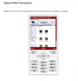
What does your site look like on Opera Mini? I tested one site and it looks pretty good without having actually designed for mobile. I’m not sure if anyone would be buying from their phone but on this site they could if they wanted to. Opera Mini is a lot kinder that Nokia or Sony Erickson’s views of the same site. Nokia didn’t even load it. Anyway try it out here http://www.opera.com/mini/demo/.
Is mccormicky.com Too Plain?
Please leave a comment if you think mccormicky.com ok as is or too damn plain.
Reasons for Remaining Plain:
I want people to read my articles without being too distracted so I have kept a “plain” look for a long time ( I prefer to think of it as subtly simple rather than just plain plain). I generally dislike clutter. If I could control clutter in my home I would. But I can’t toss out my housemate’s stuff…
Reasons for Being More Ornate:
My website should reflect what I can do as a designer. Thinking people will look at my portfolio and judge based on that work after the 1st impression of my site –well, this might be faulty logic.
What do you think?
Disappearing Web Designers
Most of us chug along trying to make websites that cover the bases:
Accessible,Functional,Interactive,Good Looking,Standards Compliant.
But some of us act like shifty car salesmen and give the rest of us a bad rep. Uncool. I was just in my favorite neighborhood wine store discussing plans(and buying a nice red) to build the store’s online store. A woman in line was listening and piped in with “what is up with web designers? Why do you all disappear on me?”. The wine merchant/store owner also agreed that that had happened to him,too.
Ok, first of all most expert designers who discuss financial practices online in blogs and how-to sites tell a budding junior designer to get 50% of the total cost of the job upfront.Because,I didn’t say this in the store,the ripping off goes both ways.The client disappears,too. Or has one do all this “spec” work and then drifts off or loses interest in the project.
But if a web designer accepts any money at all they are bound to finish and deliver product.Case closed.There is no excuse for disappearing.And disappearing with money you didn’t earn is robbery.
I feel it is not the client’s job to make sure my rent is paid.I’ve learned my lesson and no longer rely on a check in the mail to live on.Too risky and too awful,in my opinion. I say please try to plan your business model so that you don’t have to get nasty and all collections agency on a client.However this like all other lessons in life is one that has to be learned.Then you never do it again.
Clients to avoid:
Clients who tell you they will trade goods for your services. Because the last time I checked humans can’t eat floor tiles,or whatever it is they want to trade. This is a cash run world.People get paid money nowadays. So give me whatever that 24 boxes of floor tiles is worth. In green money.
Clients to embrace:
Cool clients are just cool people. All of my clients are relaxed and fun.This makes working for them relaxed and fun.They’re also all extremely honorable which just ties into the whole being cool thing.
But I’m sure they’d all turn into ass kicking ninjas if I ever dared accept a dollar from them and then stopped working on their websites.
Be cool yourself.I’m not talking about wearing the right shoes or having the right hairstyle.I’m talking about having a level headed and flexible approach to the project.And always deliver.
People rely on us. Just like they rely on nannies and car mechanics. It’s the responsibility of the designer in question to be reliable and contactable.
Hopefully less and less fly by night web designers will crop up and give the rest of us who try to work and act like normal people a chance to prove that Web Design is a business mostly populated by trustworthy and hard working individuals.
