Internet Explorer and Z-Index and me

I’m sure you’re already aware of this but IE is a pain in the butt. I just spent more time than I like to admit trying to figure out why my dropdown menu would not stay open (on mouse hover) over my stupid slideshow. At first I thought it was because my stupid slideshow had a z-index value that was too high. So I spent time messing that up. But then I noticed a very curious thing: when I added a background color to the ul, the menu stayed open over the slideshow.

Hmmm.

I had added a background color to the ul but I’d used rgba for a transparent-ish background.Lower versions of IE(less than IE9) ignore rgba and I knew this. What I didn’t know, shockingly enough was that lower versions of IE will create a bug when they have an element with z-index and no background color. So if you want your drop down menus to stay open on hover over another element (no matter if it has z-index or not) you better add a background image or a color or both.

IE is so EVIL!!!!!!!!!!!!!!!!!

The Is No Place To Order Good Chinese Food From In Fort Greene

wah-wah-wahI don’t care that at a quick glance Fort Greene appears well stocked with Asian Eateries. Yes, there are about 200,000 Thai restaurants on Myrtle (OK, 3). And about 340,000 Chinese restaurants (more like 20) with a few spatterings of Indian occurrences but Thai is Thai and Indian is Indian (not sure why I mentioned it now that I think of it–desperation?) and those Chinese restaurants are not Good Chinese restaurants.
Have you ever eaten in any of the many “Dog Food” Chinese establishments on Myrtle, Dekalb or Park? If you are not sure, here is how to spot a “Dog Food” Chinese restaurant: your order is thrust at you through a bullet proof partition and it is always garbage. Their main focus seems to be deep frying chicken and french fries (the fries are crinkle cut and chicken wings are immensely battered and both have been frozen for about 26 years).

Plus, there are faded pictures of food on the walls. I always know the food is going to suck if there are pictures of it on the walls.

The one acceptable Chinese restaurant on Myrtle does not deliver and is 16 blocks from my house. I don’t want to make the 32 block hike for food, even for Sichuan. As the deprived and lazy grow in numbers if we band together we might be able to get a City ordinance to Force Kum Kao to deliver. Or better yet, entice and entreat several proper Chinese food chefs to move in and open shop.

We Can Do It!

Disappearing Web Designers

Most of us chug along trying to make websites that cover the bases:
Accessible,Functional,Interactive,Good Looking,Standards Compliant.

But some of us act like shifty car salesmen and give the rest of us a bad rep. Uncool. I was just in my favorite neighborhood wine store discussing plans(and buying a nice red) to build the store’s online store. A woman in line was listening and piped in with “what is up with web designers? Why do you all disappear on me?”. The wine merchant/store owner also agreed that that had happened to him,too.

Ok, first of all most expert designers who discuss financial practices online in blogs and how-to sites tell a budding junior designer to get 50% of the total cost of the job upfront.Because,I didn’t say this in the store,the ripping off goes both ways.The client disappears,too. Or has one do all this “spec” work and then drifts off or loses interest in the project.
But if a web designer accepts any money at all they are bound to finish and deliver product.Case closed.There is no excuse for disappearing.And disappearing with money you didn’t earn is robbery.
I feel it is not the client’s job to make sure my rent is paid.I’ve learned my lesson and no longer rely on a check in the mail to live on.Too risky and too awful,in my opinion. I say please try to plan your business model so that you don’t have to get nasty and all collections agency on a client.However this like all other lessons in life is one that has to be learned.Then you never do it again.
Clients to avoid:
Clients who tell you they will trade goods for your services. Because the last time I checked humans can’t eat floor tiles,or whatever it is they want to trade. This is a cash run world.People get paid money nowadays. So give me whatever that 24 boxes of floor tiles is worth. In green money.
Clients to embrace:
Cool clients are just cool people. All of my clients are relaxed and fun.This makes working for them relaxed and fun.They’re also all extremely honorable which just ties into the whole being cool thing.
But I’m sure they’d all turn into ass kicking ninjas if I ever dared accept a dollar from them and then stopped working on their websites.
Be cool yourself.I’m not talking about wearing the right shoes or having the right hairstyle.I’m talking about having a level headed and flexible approach to the project.And always deliver.
People rely on us. Just like they rely on nannies and car mechanics. It’s the responsibility of the designer in question to be reliable and contactable.
Hopefully less and less fly by night web designers will crop up and give the rest of us who try to work and act like normal people a chance to prove that Web Design is a business mostly populated by trustworthy and hard working individuals.

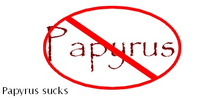
A Short Discourse on font-family Papyrus

papyrus.jpg

People in the ARTS. Please! Stop it right now. Stop using Papyrus!

I know you teach Yoga.I know you make beaded jewelry or ceramic crafts. I know you teach dance or movement of some kind. I know you are artistic and sensitive. But you still make me want to slap your face when I see that you have used Papyrus for the font for your entire website. There are perhaps 15 other font-families you can select with Yahoo Site Builder. Excluding Comic Sans, they are all far more appropriate for reading text online. Well, maybe not Monotype Corsiva. Let me address your artistic nature, the one that leads you to select this now completely dead font for your web pages;it’s not making you look any more spiritual or artistic. It’s just making you look pretentious and unimaginative. The fact that you used Yahoo Site Builder I will try not to hold against you.But there is an awfully similar look to all websites built with this lame app, not unlike the tacky scourge that was spread by Frontpage. Yahoo Site Builder gives you the option of designing your site by yourself. So a ton of people went and did just that. And you can tell!

Spotting Yahoo Site Builder Websites:
Usually the unbordered page text floats over a hideous or boring background (sometimes the background image is an image of a body of water because water is, as we all know a symbol of life and spiritual types are prone to this wallpaper).Then there is an image of the perpetrator of this mini-design crime of asthetics and then some links also floating un-anchored somewhere on the page.Sometimes to the left,sometimes to the right but never attractively or sensibly.
Can you please use Georgia? Or even just “sans-serif”? What about Arial? It’s not so bad.There’s Helvetica,too what did it ever do except be readable and serviceable?