Good News For All Us Font Freaks

I grouse frequently and often about how limited the selection of “core” fonts is with which to use in web design. Some say there are 16. Some say there are only 3. 16 or 3 it’s bound to come up with a client that the font you’ve used is “too clinical”,”schoolkid-like”,”typewriter-ish”,”dull”,”really bad”,”bad, awful, not at all what I want”…etc. You bow your head in shame. After all, if you were any kind of good web designer you could make the font pretty,couldn’t you?

Actually… I have a ka-ba-ja-zillion fonts downloaded to my computer so yes I can use any freaking font I want and I will see it in the design. You will not. You will see a default list of fail safe, dull, old universal core fonts. If everyone downloaded 10 fonts a day for the rest of their lives there would still be a big fat chance that the font you are using isn’t going to be in their computer. ‘Cause of all the fonts there are in the world.

Give us web designers a little bitty break,puleese. The reason we stoop so low as Arial is because it is the number one font everyone is bound to have. We might get all crazy and try to use Century Gothic because maybe 65% of the internets have it loaded but the rest sees Arial and thinks it sucks.

sIFR to the rescue. And if you use WordPress,Alejandro U. Alvarez to the rescue.

You should take a look at this picture,
otherwise you may have trouble understanding what the name field means or what selector means.

Also you should know that his plugin uses sIFR version 2 so you cannot use Ian Purton’s online conversion tool.

Alejandro included a command script you can run in Flash to automatically get your fonts and make swfs but I found it easier to download my own copy of sIFR package version 2.0.2. I opened sifr.fla in Flash, selected my font and then exported the movie in mac flash version 8. I closed sifr.fla without saving the changes.

I uploaded the font.swf to the right folder in the custom fonts plugin folder and I edited the custom_font.php file as instructed. His instructions are on the plugin page,so scroll down to find them.

I tried to do it his way with command> run command script he provided but when I used the produced swf I got this output on my page titles “text made by sifr version 3” or something similar. This just meant I was using incompatible versions of either mac flash or sIFR! Yeah, as simple as that.

I am not as nifty as Ian Purton but if you need a font you can email me the .ttf or .ot font you would like converted to a .swf and I will make you one in Flash. It takes about a minute to do. i may even already have it.

I should tell you that I am using Baar Sophia but what you are probably seeing is Trebuchet MS or Helvectica. And if you haven’t got those fonts you’re probably seeing Times New Roman.

Or *censored* Arial.
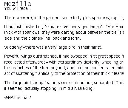
Typography or font-weight,which is the culprit here?

font firefoxfont ie7
These are 2 screenshots of paragraphs, the first image shows arial with font weight set to normal and about 14px in FF,the second in IE 7.

Just to make certain it wasn’t a flaw in the stylesheet I wrote I checked this issue on many other webpages of very well known CSS experts and noticed the same thing happening on their sites. FF shows a light, less dense looking pixel value, IE7 shows a better looking (in my opinion) typeface rendering.
It doesn’t matter if I specify font-weight,normal the difference persists.
So is it my choice of typography or a font-weight bug?
I messed about with a few different font-families and font weights but setting the body base font weight to bold looks too dark and chunky to me.No matter what I’ve tried so far I can’t find a way to make both pages look the same.
Then I found this link on Simplebits Do websites need to look exactly the same in every browser ?
Hmm.

The wily float. One day I will master you.

Laugh at me if you want but I am not ashamed to say that floating multiple divs inside containing divs or wrappers to you purists, sometimes still throws me.

Some other CSS stuff:

I really try to avoid using hacks because I keep reading on how they will all be depreciated sooner or later. I believe them even if I don’t know who they are.
I do reset my margins and padding with the * {margin:0;padding:0;)
that old chestnut. But as far as voice family this and inherit that I am dubious.
I rely on the margin:0 auto a lot to center boxes…is that wrong?
I don’t often use position:absolute or relative. Oh, but I used to.
I like to use blocks of color rather than background images.

I like big font sizes.
I like white space.
I set body font with the old 62.5%/1.5 em . I find it makes font-size easier to control farther down in the style sheet. Also, the cool kids do it.
Line-height is important.
I don’t think there’s anything wrong with using fixed width. It’s so friendly.
I compulsively validate my html. The larger the document the harder it is to make sure every tag is closed and correctly nested. Why just now I found I’d put in a li without a ul or a closing < /ul >, the horror.
If I can’t see a particular div or whatever I give it a garish background color of #ff3399 and size it up another 100 pixels or so. You’ll always be able to find a massive pink box.
I try to use shorthand but sometimes I have to be verbose first then trim it down. I’m not sure why.
If the design is for a site that is going to be read I try to make it a readable page. Call me crazy.
I will never use a bad photo. You should never need to use bad photos when digital cameras are less than 150 dollars and programs like Photofiltre and Gimp are free.
Everything I know I learned from Googling.

Arial, Helvetica, sans-serif ? Thanks Microsoft.

I used to include helvetica in my font string by rote. I never really looked at it in action. I admit I never thought much about it. Until I wanted to use some new fonts and wondered why the next font down in my font string showed. Well, helvetica is a universal font that everyone has installed by default in their computers,which explains why it would be displayed by my browser but Volute wouldn’t. I had helvetica but I didn’t have Volute.
Here is a list of default fonts .
The idea is compromise. List first the font you really want to use and that you have installed and hope someone or many others have it,too. Then list a few other fonts separated by commas ending with a sure-fire sans-serif or serif. Use Weiss Lapidar for a heading and your body font will show, hence the need to specify some “fallback” font-families in your font string.
I recently downloaded this font along with Volute and about 20 others. But only my machine can see them.
There are a few universal font families: Arial,Trebuchet MS,Tahoma,Palantino Linotype, and etc.they fall into serif or sans serif. I’ve seen sans and sun-sans,too.
Use these and no matter what browser anyone viewing your page with will see these fonts.
Continue reading Arial, Helvetica, sans-serif ? Thanks Microsoft.