The best WordPress Shopping Cart Plugin available to date is definitely the one from Instinct Entertainment. The shopping cart comes with 3 free themes and each is ready to be customized extensively.
I know there have been some browser problems with some of the themes but I think they have been worked out.
You can choose from several low cost modules to add on to the free version of the shopping cart plugin in order to have a gallery of multiple images under the main product photo, amongst other cool extras.
When it comes to the main product photo, the one you upload first when adding a new product, you may have experienced some difficulty with the way the resulting thumbnail image is cropped and re sized after uploading. This is the most important picture because its the one customers will see first. It’s been my experience that all product photos turn out the best if shot against a white background with an equal amount of empty space around the item at the top, sides and bottom.You’re going to really want to strive for uniformity because more often than not your product pages are going to show more than one product at a time.
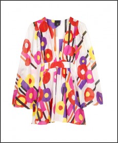
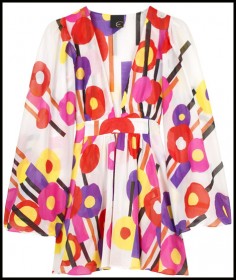
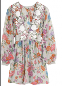
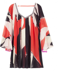
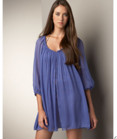
Take a look at these 2 pictures:
You can see in the 1st photo there is enough space around the product to result in a nicely resized thumbnail image. But the second photo will get chopped off because there’s not enough space around the product.
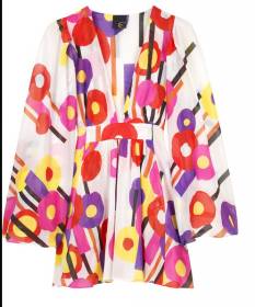
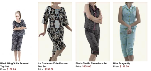
This is a screen shot of a row of products with photos that all had the same amount of white space:
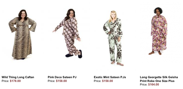
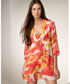
In the second screen shot, the 1st product photo in the row shows what happens when there is too much space at the top of the model’s head and not enough at the bottom of her feet. And because the other photos in the same row have different cropping and background colors, this row does not look as neat and clean as the first.
Many online customers judge an ecommerce website’s “trustability” by how professional it looks. So spending a little extra time on your product photos will pay off with professional-looking product pages.
