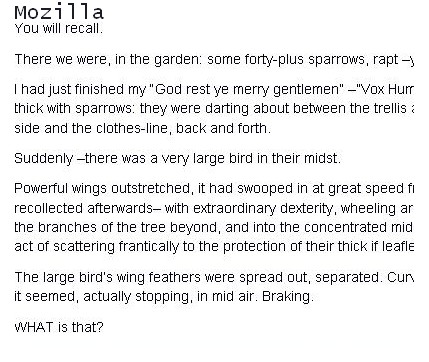

These are 2 screenshots of paragraphs, the first image shows arial with font weight set to normal and about 14px in FF,the second in IE 7.
Just to make certain it wasn’t a flaw in the stylesheet I wrote I checked this issue on many other webpages of very well known CSS experts and noticed the same thing happening on their sites. FF shows a light, less dense looking pixel value, IE7 shows a better looking (in my opinion) typeface rendering.
It doesn’t matter if I specify font-weight,normal the difference persists.
So is it my choice of typography or a font-weight bug?
I messed about with a few different font-families and font weights but setting the body base font weight to bold looks too dark and chunky to me.No matter what I’ve tried so far I can’t find a way to make both pages look the same.
Then I found this link on Simplebits Do websites need to look exactly the same in every browser ?
Hmm.