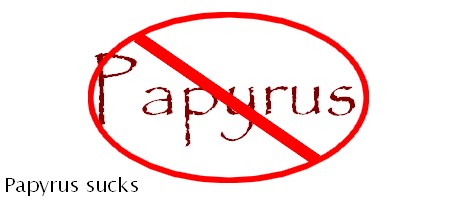
People in the ARTS. Please! Stop it right now. Stop using Papyrus!
I know you teach Yoga.I know you make beaded jewelry or ceramic crafts. I know you teach dance or movement of some kind. I know you are artistic and sensitive. But you still make me want to slap your face when I see that you have used Papyrus for the font for your entire website. There are perhaps 15 other font-families you can select with Yahoo Site Builder. Excluding Comic Sans, they are all far more appropriate for reading text online. Well, maybe not Monotype Corsiva. Let me address your artistic nature, the one that leads you to select this now completely dead font for your web pages;it’s not making you look any more spiritual or artistic. It’s just making you look pretentious and unimaginative. The fact that you used Yahoo Site Builder I will try not to hold against you.But there is an awfully similar look to all websites built with this lame app, not unlike the tacky scourge that was spread by Frontpage. Yahoo Site Builder gives you the option of designing your site by yourself. So a ton of people went and did just that. And you can tell!
Spotting Yahoo Site Builder Websites:
Usually the unbordered page text floats over a hideous or boring background (sometimes the background image is an image of a body of water because water is, as we all know a symbol of life and spiritual types are prone to this wallpaper).Then there is an image of the perpetrator of this mini-design crime of asthetics and then some links also floating un-anchored somewhere on the page.Sometimes to the left,sometimes to the right but never attractively or sensibly.
Can you please use Georgia? Or even just “sans-serif”? What about Arial? It’s not so bad.There’s Helvetica,too what did it ever do except be readable and serviceable?
Sadly, after months (and bloody months) of (if I do say so myself) some rather creative and distinctive designs the client has decided what she wants; “Papyrus, like in Word but with a few tweaks so it’s original.” I vomit. Do the design and take the money. Why they didn’t just do it themselves I’ll never know.
That’s a really difficult situation,because can you say “That font has been overused to the point of being ridiculous–let me show you some unique and beautiful fonts I was thinking might work better for this project”? Of course you can try…but will they listen?
Maybe they just haven’t seen that many fonts and that is why they picked that one?
Loads of people don’t know that there are a million better fonts because they only see what they’ve got installed by default-which can be as little as 30 fonts.
I had a client who thought Papyrus was the cat’s pajamas and thought I wasn’t any good at graphic design because I kept trying to talk him out of using it on everything.It wasn’t until after I made these suggestions I realized their restaurant menus,signs and the awning were all set in Papyrus.
They were sort of a lost cause,ha ha.