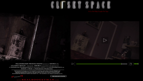
 The first first is a chance to design a movie trailer web site for a friend of mine, Sheru Arora (I did his main site askarora.com). I have always wanted to do one and best of it it’s a Horror flick. My favorite genre these days. I’m not sure what is is, a ghost story or a monster story or both. But it looks exciting and scary. It’s called Closet Space and is sure to scare the pants off of you. I know I used to be afriad of the closet.Especially after seeing Poltergeist as a kid. Parents be warned it’s probably going to cause trauma in small chirrens.
This is a fluid width site which means I did not use #page{width:980px}. Main divs are using percents. I started doing this for my main content div and my sidebar div on other websites but never for a wrapper. The big reason I wanted to try this is because I now have a widescreen monitor. That’s basically it. I’m really not involved in the fluid vs. fixed debate.
The screenshot shows the background image, the trailer playing in the ProPlayer Plugin for WordPress, and the Closet Space banner. I was given a still image from the trailer to work with as the background image. It did not look right “as was” so I grunged it up in Photoshop with some grunge brushes I got from Deviant Art which, by the way is my number one Photoshop Resource destination.
The banner logo is made up of 5 or 6 text layers all set to Overlay and using the blend option Outside Glow. The more text layers, the brighter the glow got. The font face is Baskerville.