Changed homepage_product_functions.php For WP Shopping Cart plugin 3.6.12

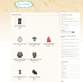
example of 3 product categories in one page

Revision!
When I was checking the file I noticed a few minor mistakes and un-needed HTML. I also wanted to show an example image from my shop which is installed on this website but is not in production,yet. The example image shows that I have inserted 3 product categories into a WordPress Page. This is not the default WPSC Products_Page but a new page I made just for this purpose. The products are displayed as if I had Grid View even though I deleted my Gold Cart files when I last upgraded to wpsc version 3.6.12 and never had Grid View installed on this server.

Changes to version 5 of my homepage_products_functions.php:
Removed div.goddamn
Replaced class=”product_image” with class=”center”
Removed div.clear
Removed a division id that would render pages invalid

Download the changed file here

[download id=”3″]

New CSS
.homepage_products{overflow:hidden;width:100%;position:relative;}
/* Adjust for your product images w+h & if using variations and want them visible in the product box*/
.homepage_products .category_view_product{position:relative;width:200px;height:205px;float:left;margin:8px 3px; text-align:center;}

/* styles the product title I’ve left it blank*/
.homepage_products a.wpsc_product_title{}

/* centers the product thumbnail image*/
.homepage_products .center{padding:4px;text-align:center;margin:0 auto;display:block}

/*styles the product price-I’ve left this blank*/
span.pricedisplay{}

Disclaimer

In case anybody cares I am not providing this file as a way to rob the plugin authors. The changes I have made to the file do not give you anything but a product thumbnail image that links to the single product page instead of to a thickbox pop up image. Buying the Gold Cart allows you to have more payment gateways,multiple product images and other great stuff.

The rest is all simple CSS and not using “full display” when inserting a wpsc category id into a Page or Post.

I myself have purchased the Gold Cart and have encouraged all my clients to purchase it as well. I fully support the WP-Ecommerce plugin authors. I began working on this file as a way to perfect SEO for shopping cart pages because being able to use one’s own WordPress Pages along with the venerable All In One SEO Pack plugin vastly improved the SEO for my client’s carts. Not to mention the fact that if they have Grid View they ought to be able to have Grid View site-wide not just on the plugin’s pages.
Revised File For Fake Grid View

how to get grid view wordpress shopping cart
a shop page suing my fake Grid View:

Very happy to report that you can still “fake” Grid View in Posts/Pages using version 3.12.6 of the WordPress Shopping Cart as the paid for Grid View Module. Most times upgrading a plugin will mean I will have to work very hard to re create the desired effects with the new code. But this time I caught a break and the changes were minimal.

CSS for Grid View-esque Styled Shop Pages in Posts or Pages
These are my suggested styles. You can do what you like just remember that float:left is the main element of Grid View.

/*makes sure things look ok in IE and floats don’t get wonky*/
.homepage_products{overflow:hidden;width:100%;height:auto;position:relative;}

/Product title. !important will override link styling */
.homepage_products a.wpsc_product_title{color:#000!important;font:bold 11px arial!important}

/*adjust widths and heights to fit your product thumbnail */
/* Add padding for more “air” in the boxes, add a border or background color,too. Go crazy!*/
.homepage_products .category_view_product{position:relative;width:155px;height:350px;float:left;margin:8px 8px 2px 6px;}

Download homepage_products_functions.php
*Note* This file was edited April 21st,2009 to correct a validity issue.
[download id=”3″]
FTP to your WordPress Shopping Cart plugin folder and rename the current file: homepage_products_functions_old.php,
if there is a disastrous error you can delete my file and rename the other one, no harm done.
Then upload the edited file, tweak your stylesheet and enjoy!

Good Looking Product Photos for WordPress Shopping Cart Plugin

The best WordPress Shopping Cart Plugin available to date is definitely the one from Instinct Entertainment. The shopping cart comes with 3 free themes and each is ready to be customized extensively.
I know there have been some browser problems with some of the themes but I think they have been worked out.

You can choose from several low cost modules to add on to the free version of the shopping cart plugin in order to have a gallery of multiple images under the main product photo, amongst other cool extras.

When it comes to the main product photo, the one you upload first when adding a new product, you may have experienced some difficulty with the way the resulting thumbnail image is cropped and re sized after uploading. This is the most important picture because its the one customers will see first. It’s been my experience that all product photos turn out the best if shot against a white background with an equal amount of empty space around the item at the top, sides and bottom.You’re going to really want to strive for uniformity because more often than not your product pages are going to show more than one product at a time.

Take a look at these 2 pictures:

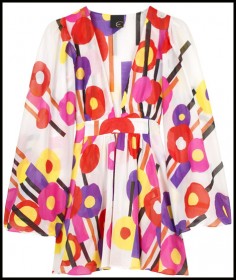
goodtoo closely cropped

You can see in the 1st photo there is enough space around the product to result in a nicely resized thumbnail image. But the second photo will get chopped off because there’s not enough space around the product.

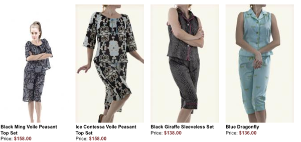
This is a screen shot of a row of products with photos that all had the same amount of white space:

a neat row of pictures
ex.1

In the second screen shot, the 1st product photo in the row shows what happens when there is too much space at the top of the model’s head and not enough at the bottom of her feet. And because the other photos in the same row have different cropping and background colors, this row does not look as neat and clean as the first.

a not so neat row
ex.2

Many online customers judge an ecommerce website’s “trustability” by how professional it looks. So spending a little extra time on your product photos will pay off with professional-looking product pages.

Opera Mini Browser

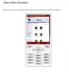
website as seen by opera mini

What does your site look like on Opera Mini? I tested one site and it looks pretty good without having actually designed for mobile. I’m not sure if anyone would be buying from their phone but on this site they could if they wanted to. Opera Mini is a lot kinder that Nokia or Sony Erickson’s views of the same site. Nokia didn’t even load it. Anyway try it out here http://www.opera.com/mini/demo/.