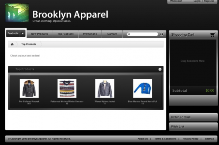
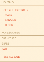
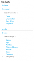
For this one design of Webstore I’m using a horizontal dropdown menu instead of a vertical one. When a category tab in the menu is selected, if that category has child categories, a submenu is displayed, floated to the left of the main column that has the product list. I really needed to be able to use a narrow column if the subcategory list was shown and a wide column if it was not. I needed to use an if, else statement.
I added an else statement so that after the first if fires off and the submenu is to be shown, a div named main will be used. If it wasn’t to be shown div.mainwide was to be used. It’s a small change but it solved the issue of having one style for the product list pages just because of a submenu that is visible only when when a category has child categories. Now instead of 2 views and 1 style I have 2 views and 2 styles.
Original code in productlist.tpl.php.
[php]<?php if($this->subcategories && (count($this->subcategories) > 0)): ?>
<div style="display:inline; float:left;"><br />
<p style="font-weight: bold; margin: -10px 0 8px 15px; "><?php _p("Browse subcategories"); ?></strong></p>
<ul style="margin: 0 0 15px 0;">
<?php foreach($this->subcategories as $categ): ?>
<li style="margin: 0 0 3px 15px;"><a href="<?= $categ[‘link’]; ?>">>> <?= $categ[‘name’]; ?></a></li>
<?php endforeach; ?>
</ul>
</div>
<br style="clear:both"/>
<?php endif; ?>
</div>
<div id="main_panel" class="rounded {2px transparent}">
<?php $this->dtrProducts->Render(); ?>
<br style="clear:both"/>
</div>[/php]
My code:
[php]<?php if($this->subcategories && (count($this->subcategories) > 0)): ?>
<div class="subcatlist">
<ul>
<?php foreach($this->subcategories as $categ): ?>
<li><a href="<?= $categ[‘link’]; ?>"> <?= $categ[‘name’]; ?></a></li>
<?php endforeach; ?>
</ul>
</div>
<div class="main">
<?php $this->dtrProducts->Render(); ?>
</div>
<?php else : ?>
<div class="mainwide">
<?php $this->dtrProducts->Render(); ?>
</div>[/php]
**edited Nov19th,2009**
In case you are scratching your head about this post I don’t blame you. I sometimes publish a post without proofreading that much!
To clarify what I am rambling on about above: I am trying to present a workaround if you have removed the left or right column of webstore because you only need to show a left or right column when the sub category list is being shown.
Perhaps you decided to use a horizontal menu or feel no need to have any other columns but the main content panel? How then might you show the subcategory list without needing to use an inline style?
By default the template uses an inline style to show the subcategory list. I happen not to like using inline styles because I find them hard to manage and they can end up giving code bloat. Besides with 76 template files, you’re going to want to streamline as much as you possibly can!
Because it is sort of hard to style one div for 2 views (one with a left or right column and one without), I used a php statement to show one div if we are going to be seeing the subcategory list and another if we are not. When we see the subcategory list we use a narrower px div. When we don’t see the list we can use a wider px div. This frees us up from having to use a div sized to accommodate another div that is only visible if we are browsing a category that has subcategories.
